App Structure
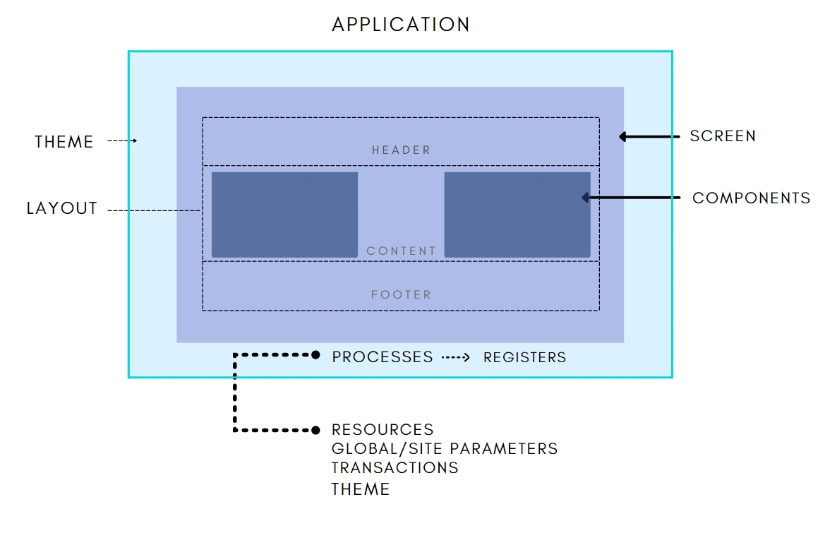
Apps in Veritran Studio are built from different kinds of elements. Refer to the diagram and definitions below to understand these elements and how they interact in the development of your app.
 |
Theme: Group of styles, variables and custom settings that defines the colors, sizes, fonts, backgrounds and other elements of the look & feel of your app. You can assign the same theme to several apps.
Layout: The way in which the sections or spaces of a screen are arranged (for example, a screen can have a region for a header, one for content and another one for the footer).
Component: Native object or visual element that performs a specific action and is used to build a screen. It can typically be customized with specific attributes.
Library component: Component that has been saved for reuse in other screens, modules or apps.
Widget: Feature or improved component created outside Studio that can be integrated into the app.
Screen: Previously referred to as Site View or View Instance, a screen is any view of an app that contains components and is created using the Drag & Drop feature.
Process: Sequence of steps that add logic to an app. Each step runs an operation or function.
Register: Stores values or information that is available throughout the application. Registers may consist of numbers or descriptive names.
Transaction: Service executed in the middleware of the Veritran platform that might add logic to your app and allow you to connect with external services.
Resource: Element used in Studio to build apps, like images, icons, video or audio files, fonts, .html files, widgets, etc.
Parameter: Global configuration information given to the different components of the platform or to individual apps.