Library
Library components are reusable components that you can include in a screen by duplicating them or referencing the original element. You can add an individual component to the library, or a container component that includes several components.
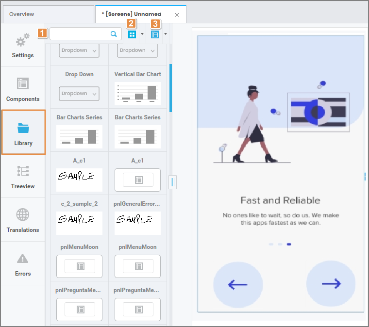
In this tab, you can visualize every library component created in the environment. Refer to the annotated image below to learn more about this tab.

1. Search Bar. Search for library components by name.
2. Viewing Options. Switch between card and list view.
3. Sorting Criteria. Sort components alphabetically or by type.
Creating and Using Library Components
To create a new Library Component, select from the canvas or the tree view the component you wish to reuse (after editing all its attributes), and then click Create Library on the toolbar, as shown in the image below.

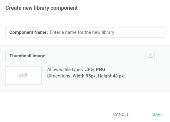
A pop-up window appears, where you need to add a name to the new library component and a thumbnail. Make sure the thumbnail image is below 95x48 pixels and is in .jpg or .png format. Click Save and the new component will be available on the left panel.

To use an existing library component, drag and drop the desired component from the panel into the canvas. A pop-up window opens with two options:
Link: Invokes the original component into your screen. You are not able to modify a linked library component, and any update made to the original component will then be reflected in every screen where it was invoked.
Duplicate: Creates an exact copy of the original component that can be edited on the screen you are working on.