Attributes Editor
The right panel of the Visual Builder allows you to set different types of attributes for each component. The attributes to be configured will specifically depend on the selected component.
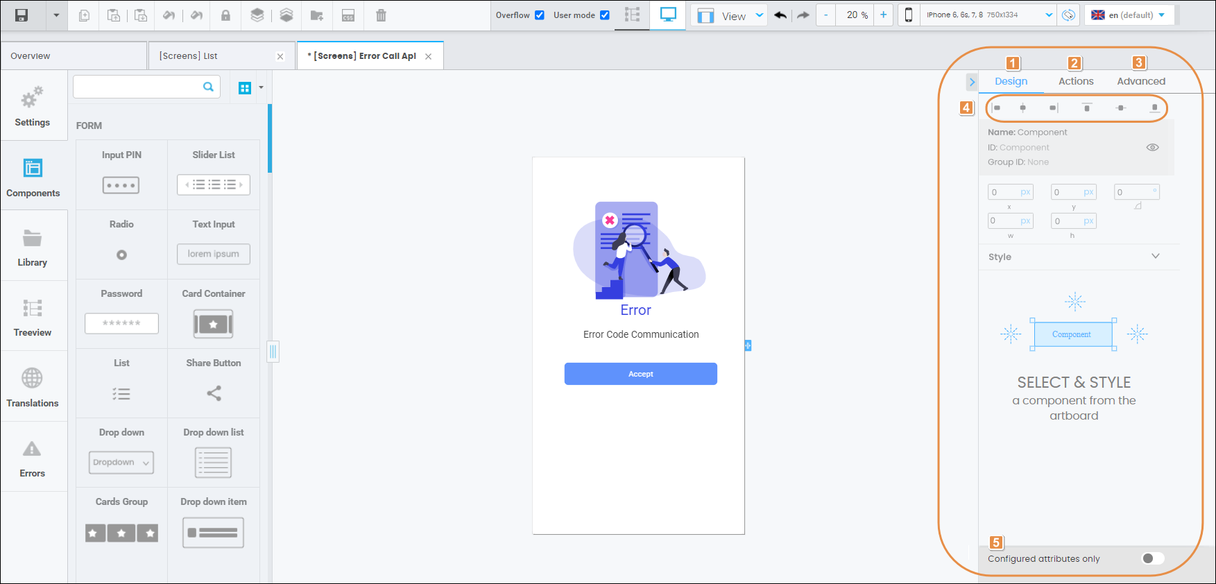
Refer to the annotated image below to learn more.

Design tab. The attributes displayed in this tab are used for configuration by default. Read the Design article to learn more.
Actions tab. Read the Actions article to learn more.
Advanced tab. Read the Advanced article to learn more.
Component position. Click on any of the six buttons available to determine the position of your component with regard to the screen’s borders. You can also set the position of your component by clicking on it and moving it across the screen.
Configured attributes only. Click on the toggle switch to show the attributes that are pre-configured by default or that have already been configured by the user. The toggle in green means it’s activated.
Important
The lists of attributes included in the Design, Actions and Advanced articles are not exhaustive but illustrative. The number of attributes to be set will depend on the component chosen.