Design
In the Design tab, you can configure basic information about the component and the attributes related to how the component will look like in the app. This section contains a variety of the attributes that may appear for configuration depending on the component selected.
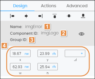
For all the components, you can see their basic details and complete the component’s alignment and size attributes. Refer to the image below to learn more.

Name. Name given to the component when created. This field cannot be modified.
Component ID. ID given to the component when created. This field cannot be modified.
Group ID. Group ID given to the component when created. This field cannot be modified.
Tip
Click on the eye icon to hide the component within the screen. The open eye icon will turn closed. To unhide it, go to the Treeview tab in the left panel, find the component and click on the closed eye icon. The component will appear in your screen again.
Position attributes. Read the chart below to learn more.
X Position
Position of the component with regard to the X axis (horizontal line). Complete with the desired position and choose one of the units of measurement available in the drop-down menu.
Y Position
Position of the component with regard to the Y axis (vertical line). Complete with the desired position and choose one of the units of measurement available in the drop-down menu.
Angle
Angle with the vertical axis in which the component is positioned. Changes made to this attribute will not reflect in the canvas. Complete, if necessary, with the desired angle.
Width
Component width. Complete with the desired width of the component.
Height
Component height. Complete with the desired height of the component.
Note
In all X, Y, Angle, Width, Height fields, you can change the unit of measurement specified. To modify it, click on the unit of measurement in each field (blue-colored text) and select any of the options available in the drop-down menu.
Read the articles in this section to learn more about the right panel sections and the respective attributes that may appear for configuration depending on the component selected.