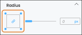
Radius
In the Radius section, you can configure the radius to define the roundness of the component's corners. You can apply the radius configuration to one or all the corners.

To configure the attributes of all the corners, click on the center of the square icon. The chain link icon and the dots representing each corner of the square turn blue (see image above). You can also configure the attributes of the corners on an individual basis by clicking on the desired corner of the square icon; the dot in the selected corner turns blue, and the broken chain link icon appears. If you choose the second option, changes in the simulator will only reflect on the selected corner of the component. Refer to the chart below to learn more about the component's radius attributes and how to configure them.
Slider bar | Option to increase or decrease the radius size. If the value is higher than zero, the sides of the square icon turn blue and the value will automatically appear in the value field. You can also type the value directly in the field. |
Unit of measurement | Click on the unit of measurement selected (blue-colored text) and select one of the options available in the drop-down menu. You will see the changes automatically applied to the component. |