Margins & Alignment
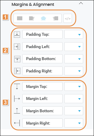
In this section, you can configure the attributes to align the text within the component and set margin and padding properties. Refer to the annotated image below to learn more.
Tip
The attributes mentioned in the image are applicable to the button component.

Text Alignment. Click on the desired alignment option: justified, left, right or centered, depending on whether you want the text to be aligned with the both left and right edges, the left edge, the right edge or centered between the two edges of the component. You can also click </> and type the code to set the text alignment manually.
Padding properties. Space between the component's border and the component's content (value). Enter a value for each of the padding properties: Padding Top, Padding Left, Padding Bottom and Padding Right. Then, click on the down arrow and select one of the units of measurement available in the drop-down menu.
Margin properties. space around a component's border. Enter a value for each of the margin properties: Margin Top, Margin Left, Margin Bottom and Margin Right. Then, click on the down arrow and select one of the units of measurement available in the drop-down menu.